Typography Poster
Project Description
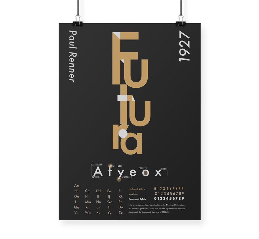
The goal of the project was to make a typography poster with one type face. Futura is one of my favourite fonts but I did not know much about it so I researched about “Futura”, its history and its personality. The meaning of Futura is “Future” in the Latin language, so I wanted to design the poster to express how I envision about the future.
The result
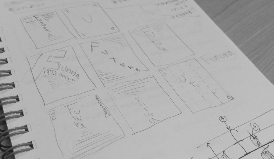
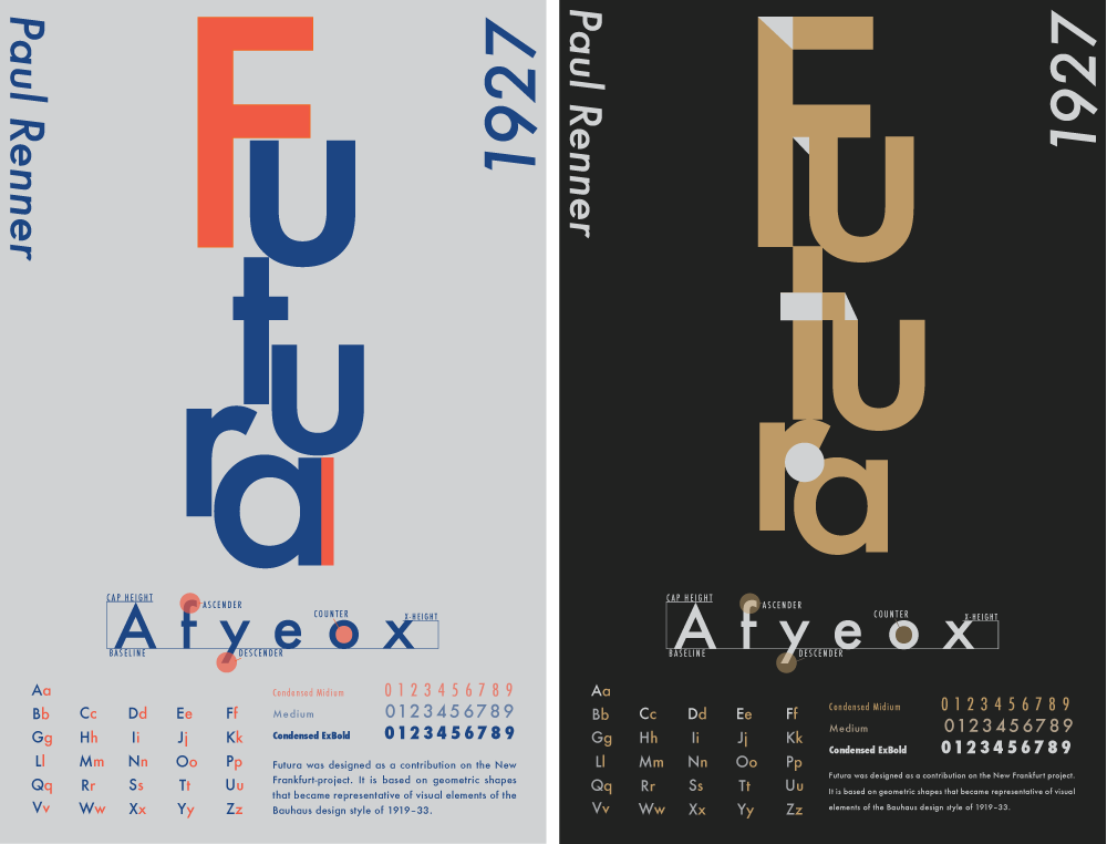
I decided to construct the characters vertically upward in order to express aiming higher to the future. Then I experimented with two different colour tones, dark and bright, to see which tone would better suit for the poster. I was initially working with the brighter colours, but I found the poster showed its character when I designed in both tones. I seek feedback from others and the majority of them commented the dark tone was more beautiful and better illustrated the impact of the word, so I decided to use dark tone in my final design.
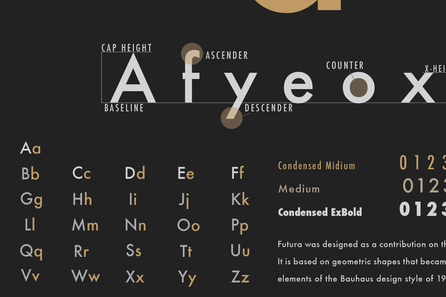
Details